
In the last 25 years, different conceptions of safety have come into being. One was the idea of first story and second story, in the report A Tale of Two Stories: Contrasting Views of Patient Safety by Richard Cook, David Woods, and Charlotte Millar. In the Prelude, the authors refer to A tale of Two Cites by Charles Dickens, which juxtaposes contrasting individual stories in the context of of the French Revolution and the Terror. They remark that “Exploring contrasts is a powerful means for achieving new insight” and go on to note that “Stunning success and appalling failure are arrayed in contrast to each other. It is in this setting that discussions about patient safety are now taking place.” The main contrast in the report concerns ‘first stories’, where failure is attributed to human error (or component failure), and ‘second stories’ where failure is associated with systemic vulnerabilities.
Another, distinction first emerged a decade ago, and can be found in a paper called A Tale of Two Safeties by Erik Hollnagel. This led to the notion of ‘Safety-II’, which was explored in a white paper published by EUROCONTROL in 2013 (and subsequently adapted for a healthcare audience1). This White paper compared two different approaches to safety. These, as described then in the Executive Summary, were as follows::
- Safety-I – “According to Safety-I, things go wrong due to technical, human and organisational causes – failures and malfunctions. Humans are therefore viewed predominantly as a liability or hazard. The safety management principle is to respond when something happens or is categorised as an unacceptable risk. Accordingly, the purpose of accident investigation is to identify the causes and contributory factors of adverse outcomes, while risk assessment aims to determine their likelihood. Both approaches then try to eliminate causes or improve barriers, or both.”
- Safety-II – “According to Safety-II, the everyday performance variability needed to respond to varying conditions is the reason why things go right. Humans are consequently seen as a resource necessary for system flexibility and resilience. The safety management principle is continuously to anticipate developments and events. The purpose of an investigation changes to understanding how things usually go right as a basis for explaining how things occasionally go wrong. Risk assessment tries to understand the conditions where performance variability can become difficult or impossible to monitor and control.”
Much has been written since on Safety-II, and the ideas have developed as might be expected for new ideas. It is fair to say that there was a basis for the ideas in previous writings, and it is also probably fair to say that none of us involved producing and promoting the original White Paper really expected it to take off in the way that it did.
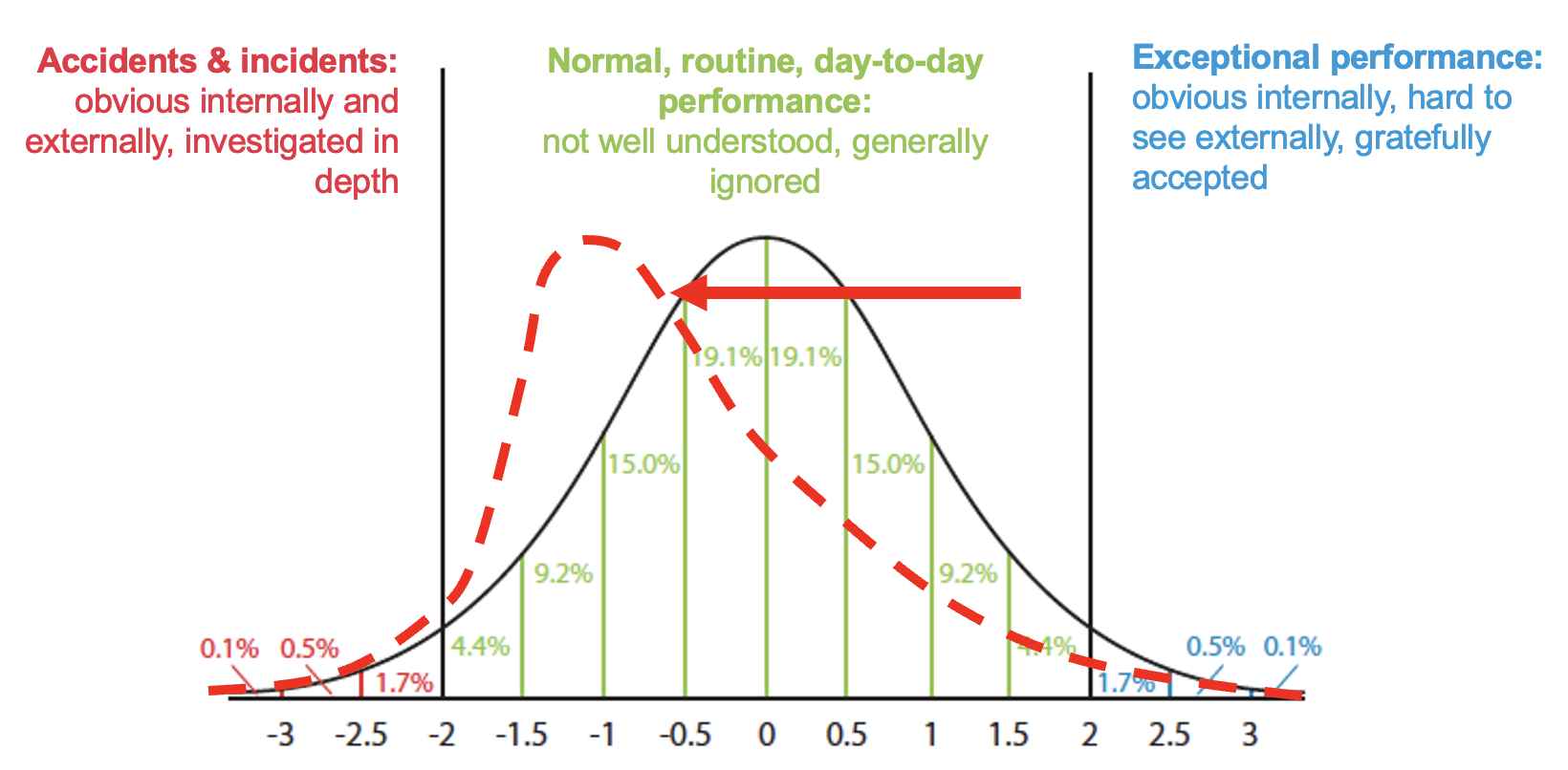
One factor that seems to influence the uptake of many new ideas is the imagery employed. In this case, a number of diagrams and graphs were used. One of the graphs was a theoretical normal distribution of outcomes (which could be any kind of outcome on any measure). The figure below (adapted from a figure in the EUROCONTROL White Paper) is of particular interest, since it specifies three zones of interest:
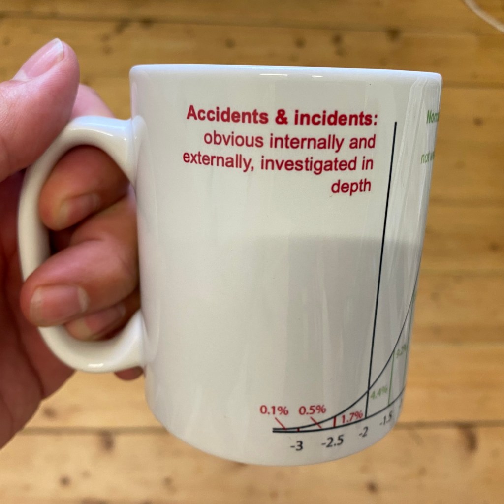
- Accidents and incidents – obvious internally and externally, investigated in depth
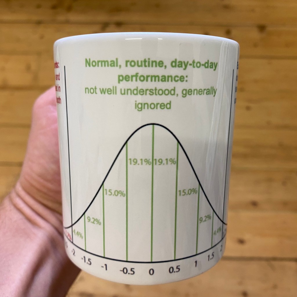
- Normal routine day-to-day performance – not well understood, generally ignored
- Exceptional performance – obvious internally, hard to see externally, gratefully accepted

Such diagrams are almost always simplifications, but for some time, a few things about this useful diagram have bothered me, since they could be misleading. The following are three of these issues.
Issue 1: The shape of the distribution
The first issue is that the shape of the distribution (which is for illustration only) will vary. Outcomes in safety-critical industries may not be, and probably are not, normally distributed in any sense. There may, for instance, be skew or kurtosis, resulting in fat tails. There could be a skew toward accidents & incidents, or even a skew toward exceptional performance, as shown below. There will be different distributions for different contexts, or changes over time, where the normal operating point moves left or right. An interesting thing here is this: if we only look at accidents and incidents (mentally cover the green part of the graph), the shape of the red line in the accidents & incidents zone increases only marginally. The number of incident or accident reports would give a misleading view of the state of performance, or perhaps even the tsunami that might be coming.

Issue 2: The boundary between accidents, normal performance, and exceptional performance
The second issue concerns the boundaries within the three zones. There is often a defined ‘line’ between accidents & incidents and normal, routine, day-to-day performance because of mandatory reporting requirements on outcomes. These outcomes may be actual harm to people, or damage to property or the environment, or the breaching of predefined limits (e.g., separation standards between aircraft). In the latter case, the boundary will usually be based on calculated risk, but may seem fairly arbitrary, with many events in the green zone that seem riskier than some in the red zone.
When it comes to the boundary between normal, routine, day-to-day performance and exceptional performance, there may be no obvious line. Here, there are no mandatory reporting requirements and there are no pre-defined categories to distinguish the two. This is largely because the former is generally ignored and the latter is gratefully accepted, if it is known at all. In many cases, only insiders (which may mean only operational staff) are aware of what happened or how performance and the outcome were ‘exceptional’. While there is no formally-defined difference between the two, I like to think about it as determined by whether and how one talks to colleagues (and perhaps family or friends) after the event. Both tails of the graph tend to be seen as worthy of some kind of informal “What just happened?!” debrief, but one is likely to be associated with punishment (individual or organisational, or both) and the other is likely to be associated with praise.

While the outcomes between the zones are different, the underlying performance is not necessarily so. This is particularly the case for accidents and incidents and normal, routine, day-to-day performance. This has been discussed by many authors, including Hollnagel et al (2013) and Shorrock et al (2014) in the context of equivalence, but hinted at much earlier even by sociologist Charles Perrow in Normal Accidents (1984), who wrote “We explain the unusual event by invoking the usual and proclaiming it to be different, when of course it is not. Instead, it is the obscure, accidental, and even random concatenation of normal disorders that produces a great event that we assume must have had great causes.”The “great event” is obvious, but the “obscure, accidental, and even random concatenation of normal disorders” are just that – obscure and normal. As well as the ‘random concatenation of nominal disorders’, there are often chance factors associated with good and bad outcomes that may be ephemeral and hard to detect, recognise or accept. On equivalence and emergence, Cook, Woods and Miller (1997) wrote that “Safety…is an emergent property of the ways in which the technical, individual, organizational, regulatory, and economic factors … join together to create the settings in which events—the best ones and the worst ones—occur.” This best and worst contrast leads me to Issue 3.
Issue 3: The boundary between accidents and exceptional performance
The third issue emerges from the two-dimensional nature of the graph. The graph makes it appear as if accidents & incidents and exceptional performance are opposites, and very far apart, qualitatively and perhaps even in space and time. In other words, there is no boundary, and what separates the two is the green normal zone. But ‘exceptional’ has two meanings, which are quite different. One is ‘unusual’ or ‘extraordinary’. The other is ‘much greater or better than usual’. The meaning implied in the White Paper – referring to outcomes – is the latter (since accidents & incidents are also unusual), but this may be misleading.
To make things even more complicated, exceptional could still mean quite different things from different perspectives. From a traditional safety perspective, considering the graph, it could mean ‘very safe’ or ‘very far from an accident’. That would normally imply an emphasis on protection and thoroughness over efficiency (bigger safety margins, more time on task, more independent checking, and more robustness generally) (see Hollnagel, 2009). The problem then is that work-as-measured (e.g., number of operations) would tend to be deemed unsatisfactory (e.g., too slow, too few) and stakeholders would tend to be dissatisfied (e.g., too much delay, costs too high, demand not met). This is hardly ‘exceptional’ from their point of view, and probably not gratefully accepted.
From a resilience engineering perspective, we might see exceptional performance as ‘very resilient’, meaning “able to respond, monitor, learn, and anticipate” according to Erik Hollnagel. But this would also apply to the middle green normal zone of the graph, so it could only be a matter of degree.
From a quality management perspective, we might see exceptional performance as exceeding stakeholder (especially customer) expectations or demands. This is also a matter of degree, and – excluding accidents – it could mean almost anything, depending on the stakeholders and the context. In some situations, it would imply an emphasis on thoroughness, but often the emphasis would focus more on efficiency (e.g., to reduce costs) than ‘gold plating’. An example from an airport operations point of view might be ‘optimum use of the runway’. In this case, capacity is increased, but the risk of incidents might be increased also. Examples of ‘waste reduction’ from other sectors can follow a similar pattern where ‘waste’ for one stakeholder group represents a safety buffer for another. Also relevant here is the Law of Limits, which I have expressed as “When you put a limit on a measure, if that measure relates to efficiency, the limit will be used as a target”.
So we are left without a clear understanding of exceptional performance, except that (as mentioned earlier) it perhaps means ‘extraordinary’, as implied by the graph. An extraordinary day is likely to recognised as such, and come up during conversation afterwards.
Related to this issue is the fact that an accident or incident for one group or organisational function (e.g., an outage or other technical failure) would count as an incident, while another group (e.g., operational staff) may well perform somehow ‘exceptionally’, preventing an operational incident. In this case, there has been an incident and exceptional performance simultaneously. The incident is likely to have been investigated, while the exceptional performance is more likely to be gratefully accepted.
This brings us to the crux of the issue. Considering the complications above, and our own experience, we might conclude that exceptional performance often means high productivity and perhaps even a near-near-miss. This is not an actual near-miss (an incident), which would be subject to any reporting requirements. It is a near-near-miss, meaning that work was close to, but within, the boundary of safe operations. ‘Exceptional performance’ often involves and requires layers of adaptations, workarounds and compromises that mean that things work even when they shouldn’t. But these same adaptations, workarounds and compromises take system performance to the edge of the red zone – accidents and incidents. It may be the outcome that determines whether performance was exceptionally good or exceptionally bad. In other words, a different outcome would affect how we judge the same performance.
Much of this can be seen in the article “A day when (Almost) nothing happened” by Erik Hollnagel, Tom Laursen and Rikke Sørensen, which will feature as a personal perspective by air traffic controller Tom Laursen in a forthcoming article in HindSight 34. In this case as per the abstract, “a computer breakdown led to the loss of most of the information in an air traffic control system. The operators managed to compensate for the missing information and keep traffic flowing, although with reduced capacity, while the technical staff managed to restart the system. The same breakdown occurred two more times during the day but in both cases the operators were able to compensate.”
Cook, Woods and Millar also talk about how “success and failure are closely related” and how “health care becomes simultaneously more successful and more vulnerable”. They state that “Success and failure are derived from the same sources … bad events are not separate phenomena that can be eliminated by the use of some managerial or technological tool.”
What we are faced with is the realisation that accidents & incidents and exceptional performance are not safely separated by normal, routine, day-to-day performance. Rather, there is a curve in the distribution, like a horse shoe or, since we don’t have much exposure to horse shoes any more, a simple mug2. Here, the boundary between accidents & incidentsand exceptional performance becomes clearer, suggesting that we need to get a handle on the difference between the two in practice.

(see instructions in footnote 2 below to print your own)
1 The EUROCONTROL white paper was a precursor to a more well-known healthcare white paper by the same name, published in 2015.
2 The image on the mug can be downloaded here. This can be printed on a mug (e.g., in the UK this).
Discover more from Humanistic Systems
Subscribe to get the latest posts sent to your email.

Excellent thought-provoking piece Steven, thank you.
It occurred to me (whilst reading it through) that the boundaries between accidents, exceptional, and normal performance may in part be determined by the perspective taken – was it from the original starting position, or had events already started to develop? At what point was the critical lens applied?
LikeLiked by 1 person
Nice mug!
LikeLike